Bombcaps: A Bold Display Font for Digital Branding
There’s that moment—right after you’ve built the hero section of a new coaching website—when you pause, scroll back up, and ask yourself: Does this headline feel like it belongs to the brand I’m trying to build? I’d spent hours refining the layout, choosing warm but grounded colors, and selecting clean, accessible body copy. But the headline? It felt safe. Generic. Like it was whispering instead of announcing. That’s when I dropped Bombcaps into the H1—and everything clicked.
What Bombcaps Brings to the Screen
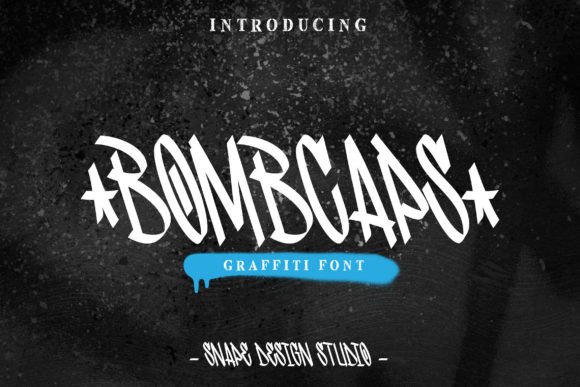
Bombcaps is a display font with unmistakable personality: graffiti-rooted, street-smart, and unapologetically expressive. Its letters carry the energy of hand-painted murals—slanted angles, uneven baselines, intentional roughness—but with the polish and consistency needed for professional digital use. It’s not “grunge” in the chaotic sense; it’s curated urban typography. Think bold spray-paint confidence, not messy stencil overlap. As a web designer, I appreciate how its character alternates and subtle ligatures add authenticity without sacrificing legibility at scale.
How It Performs in Real Layouts
I tested Bombcaps across multiple responsive scenarios: a boutique online store’s seasonal banner, a portfolio site’s project title cards, and a course landing page’s primary CTA headline. On desktop, it commands attention—especially over muted image backgrounds or soft gradients. At 48px and above, its rhythm and spacing hold beautifully. On mobile? I used it sparingly but intentionally: only on hero headlines (with viewport-relative sizing) and as a decorative accent in section dividers—not in navigation, buttons, or form fields. It held up well on iOS and Android Chrome, especially when paired with a lightweight webfont version (WOFF2) and fallback to system sans-serif.
One surprise: Bombcaps works surprisingly well in dark mode. Its thick strokes and open counters retain clarity against deep charcoal or navy backgrounds—no need for extra stroke effects or shadows. Just solid color, proper contrast, and thoughtful line-height. For accessibility, I kept contrast ratios above 4.5:1 and avoided using it for anything smaller than 32px—even then, only as short phrases like “Launch Now” or “New Collection.”
Where Bombcaps Shines (and Where It Doesn’t)
This isn’t a workhorse font—and it shouldn’t be. Bombcaps thrives where impact matters most: hero titles, campaign headers, logo lockups (as part of a wordmark), and branded section labels (“Our Story,” “Join the Movement”). I used it to style the “Work With Me” headline on a creative consultant’s homepage—and instantly elevated the perceived energy and differentiation of their offering.
It does not belong in body copy, navigation menus, pricing tables, or anywhere users need to scan quickly or parse dense information. I tried it in a blog post intro paragraph—too much visual noise. Same for small footer text or form input labels: the irregular letterforms slow reading and reduce usability. And while it supports basic Latin characters, I double-checked multilingual needs before deploying it on a bilingual client site—no extended diacritics or Cyrillic support in the standard package.
Smart Pairing for Balanced Digital Design
The magic of Bombcaps reveals itself in pairing. I consistently paired it with Inter (a highly readable, variable sans serif) for all body text, captions, and UI elements. The contrast is intentional: raw expression meets quiet clarity. For more editorial or premium-feeling sites—like a design studio’s portfolio—I swapped in a refined serif like IBM Plex Serif for subheadings, letting Bombcaps anchor only the boldest moments. Never paired it with another decorative font; that’s visual overload. And I always reserved script or handwritten fonts for micro-accent uses only—signature lines, handwritten-style quotes—not structural typography.
Practical Considerations Before You Deploy
Before adding Bombcaps to a live site, I verified three things: First, the license permits commercial web use—including SaaS platforms and client projects (it does, under standard desktop + web licenses). Second, the included file formats: WOFF2 for modern browsers, plus fallbacks if needed. Third, whether the webfont kit includes stylistic sets—yes, Bombcaps offers alternate glyphs and swashes, but I only activated them selectively via @font-feature-settings for hero text, never globally.
For performance, I loaded it asynchronously and limited it to critical display contexts—no render-blocking. And because it’s a single-weight display font (no light or bold variants), I relied on CSS font-weight fallbacks only for semantic emphasis, never visual hierarchy. That meant structuring headings carefully: Bombcaps for H1s, Inter for H2–H4, with clear visual spacing—not weight—to signal importance.
If you’re building a brand that values authenticity, creative courage, and memorable first impressions, Bombcaps isn’t just a font—it’s a tone-setter. It won’t solve weak content or poor UX, but when placed with intention, it makes your digital space feel human, confident, and unmistakably yours.