Maqel: A Retro Groovy Display Font That Elevates Digital Branding
It started with a hero section—just me, a half-finished coaching website mockup, and the quiet frustration of scrolling through dozens of display fonts that either felt too sterile or too chaotic. Then I installed Maqel. Within minutes, I’d dropped it into the headline: “Clarity Starts Here.” Instantly, the page exhaled. Warm. Confident. Uniquely human. Not flashy—but *alive*. That’s when I knew this wasn’t just another retro font. It was a design decision that quietly strengthened the entire brand experience.
What Makes Maqel Stand Out in Real Web Layouts
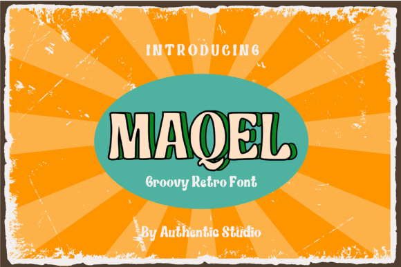
Maqel is a display font—designed not for paragraphs, but for presence. Its retro groovy personality comes from soft, rhythmic curves, subtle flares on uppercase letters, and a gentle unevenness that echoes hand-painted signage from the ’70s—without tipping into kitsch. It’s not overly distressed or cartoonish; instead, it balances nostalgia with modern polish. In practice, that means it scales beautifully: crisp at 48px on desktop, still legible and charming at 32px on mobile, and surprisingly expressive even as a 24px section heading.
I tested Maqel across multiple real-world contexts: a boutique online store’s seasonal banner (“Summer Glow Collection”), a course sales page’s primary CTA (“Enroll Now — Spots Limited”), and a portfolio site’s project title cards. Each time, it added warmth without sacrificing clarity—and crucially, it never competed with the content. It invited attention, then gracefully stepped aside.
How Maqel Performs Where It Matters Most
On responsive layouts, Maqel shines in controlled, intentional placements. I used it over a muted image background in a hero banner and found its medium weight held up well—even with light text shadow or subtle contrast adjustment. No pixelation, no blurring. Because it’s a well-hinted, OpenType-display font, it renders cleanly across Chrome, Safari, and Edge (and yes—I checked Firefox on Windows and macOS).
For accessibility and usability, I kept it strictly to visual hierarchy roles: main headlines, section titles, button labels under 3 words, and decorative accents like quote pulls or testimonial highlights. It’s not built for body copy, navigation menus, or form fields—and that’s by thoughtful design, not limitation. Using it where it belongs reinforces scannability: users instantly grasp structure, tone, and intent before reading a single sentence.
Pairing Maqel Thoughtfully for Stronger UX
Like any great display font, Maqel thrives in conversation—not isolation. I paired it consistently with Inter (a highly readable, neutral sans serif) for all body text, captions, and interface elements. The contrast works because Maqel brings voice; Inter brings clarity. For more editorial projects—like a blog redesign or digital brand kit—I swapped in a warm, low-contrast serif like IBM Plex Serif for subheads, letting Maqel anchor the top level while the serif adds rhythm below.
One unexpected win? Using Maqel for logo text in SVG headers. Its clean outlines and balanced spacing meant no awkward kerning fixes or manual path adjustments—unlike some display fonts that require heavy finessing for vector use. Bonus: it exported cleanly to Figma variables and worked flawlessly in Webflow’s custom font uploader.
Practical Considerations Before You Implement
Before dropping Maqel into your next live project, check three things: First, confirm the package includes WOFF2 files—they’re smaller and faster-loading than TTF or OTF for web use. Second, verify licensing covers commercial websites and client work (most premium display fonts do, but always double-check). Third, test multilingual support if your audience spans languages—Maqel includes extended Latin characters, so it handles accented names, French, Spanish, and German gracefully, but doesn’t cover Cyrillic or Asian scripts.
I also recommend testing readability on dark mode. Maqel’s moderate stroke contrast holds up well against charcoal or navy backgrounds—especially when set at 36px+ with 1.2 line-height. Avoid ultra-thin weights for small CTAs; stick to Medium or Bold for buttons and mobile touch targets.
Where Maqel Fits—and Where It Doesn’t—in Your Design System
Maqel excels in moments that need emotional resonance: landing page headlines, campaign banners, course module titles, testimonial highlights, and branded social graphics exported from Figma. It subtly signals creativity, approachability, and intentionality—ideal for coaches, makers, educators, and small-batch brands building trust through authenticity.
It’s less suited for dense dashboard interfaces, data-heavy tables, or legal disclaimers—places where neutrality and speed of comprehension trump personality. Likewise, avoid using it for micro-interactions (like hover tooltips or status badges) or anything smaller than 18px. Its charm lives in scale and space—not compression.
In my latest client project—a wellness brand relaunch—Maqel became the typographic heartbeat. Not in every component, but where it mattered most: the “Welcome” headline, the “Our Approach” section title, and the footer tagline. Consistent, restrained, and unmistakably theirs. That’s the power of a well-chosen display font: it doesn’t shout. It settles in—and makes everything around it feel more considered.